ITC Avant Garde Gothic®
字体介绍:
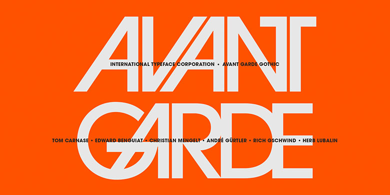
ITC Avant Garde Gothic® was designed by Herb Lubalin and Tom Carnase in 1970. They based it on Lubalin´s logo for Avant Garde Magazine - an exciting construction of overlapping and tightly-set geometric capitals. ITC Avant Garde is a geometric sans serif; meaning the basic shapes are constructed from circles and straight lines, much like the work from the 1920s German Bauhaus movement. The early versions of ITC Avant Garde became well-known for their many unique alternates and ligatures that still conjure up the typographic aura of the 1970s. These fonts contain the basic alphabets (without the old unusual ligatures). Still strong and modern looking, ITC Avant Garde has become a solid staple in the repertoire of today's graphic designer. The large, open counters and tall x-heights seem friendly, and help to make this family work well for short texts and headlines. The condensed weights were drawn by Ed Benguiat in 1974, and the obliques were designed by André Gürtler, Erich Gschwind and Christian Mengelt in 1977. ITC Avant Garde® Mono is a monospaced version done by Ned Bunnel in 1983.












 商业发布授权
 出版物授权:针对出版物
 嵌入式应用授权


