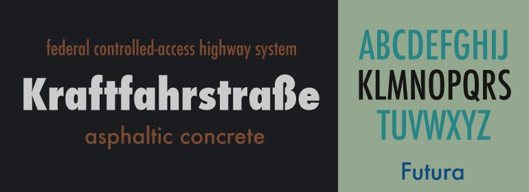
Futura®
字体介绍:
Paul Renner(字体设计师、画家、作家以及教师)基于圆形、三角形和方形的简单形状绘制出原稿。Bauer的设计工作室帮助他将这些几何形状变成了一个强健的、功能性的字体家族,随着时间的推移,Renner对Futura做了些修改使它变得更加清晰。
Futura长长的升部和降部受益于宽大的行间距。各种各样的字重和风格使其成为一个用途广泛的字体家族。Futura具有永恒的现代感; 在1928年它那么引人注目、高雅、前卫——而今,它仍然是展现力量、优雅和清晰概念的一种流行的排印之选。
First presented by the Bauer Type Foundry in 1928, Futura is commonly considered the major typeface development to come out of the Constructivist orientation of the Bauhaus.movement in Germany.
Paul Renner (type designer, painter, author and teacher) sketched the original drawings and based them loosely on the simple forms of circle, triangle and square. The design office at Bauer assisted him in turning these geometric forms into a sturdy, functioning type family, and over time, Renner made changes to make the Futura fonts even more legible. Its long ascenders and descenders benefit from generous line spacing. The range of weights and styles make it a versatile family. Futura is timelessly modern













 商业发布授权
 出版物授权:针对出版物
 嵌入式应用授权


