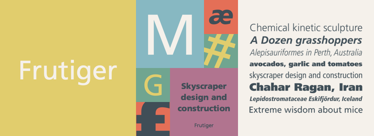
Frutiger®
字体介绍:
尽管每个人都认为他想用他那成功的Univers字体家族,但Frutiger决定制作一款新的无衬线字体,这种字体要适合机场导视牌特定的易读性要求:驾驶和行走时,距离远近及不同的角度都能被轻松识别。最终设计的字体符合现代建筑风格的机场。
1976年,他与Linotype一起合作为D. Stempel AG扩展并完成了这一字体家族,将其命名为Frutiger。
Frutiger™家族在结构上既不是严格意义上的几何体,也不是人文主义体;其字形是经过精心设计的,每个字符都能很容易被识别。该字体如此清晰使其非常适用于标牌和展示。虽然它最初是为大型机场而设计,但是整个字体家族都有一种温暖、精细的感觉,近年来,这种感觉使它更适用于杂志和小册子中显示较小的正文文本。
该家族包含14种字重及14种伴生字体,都带有中欧字符和重音符号。另外还有14种西里尔文伴生字体。
另请参阅Linotype Platinum Collection中最新版修订的版本Frutiger Next。
In 1968, Adrian Frutiger was commissioned to develop a sign and directional system for the new Charles de Gaulle Airport in Paris.
Though everyone thought he would want to use his successful Univers font family, Frutiger decided instead to make a new sans serif typeface that would be suitable for the specific legibility requirements of airport signage: easy recognition from the distances and angles of driving and walking. The resulting font was in accord with the modern architecture of the airport.
In 1976, he expanded and completed the family for D. Stempel AG in conjunction with Linotype, and it was named Frutiger.
The Frutiger™ family is neither strictly geometric nor humanistic in construction; its forms are designed so that each individual character is quickly and easily recognized. Such distinctness makes it good for signage and display work. Although it was originally intended for the large scale of an airport, the full family has a warmth and subtlety that have, in recent years, made it popular for the smaller scale of body text in magazines and booklets.
The family has 14 weights and 14 companion fonts with Central European characters and accents. Another 14 Cyrillic companion fonts are available as well.
See also the new revised version Frutiger Next from the Linotype Platinum Collection.










 商业发布授权
 出版物授权:针对出版物
 嵌入式应用授权


